

Tuesday, July 14, 2026 · 7 min read
Fix Your Homepage First
How AMW Hardscape guides existing traffic toward calls and estimate requests without sending visitors through extra pages.
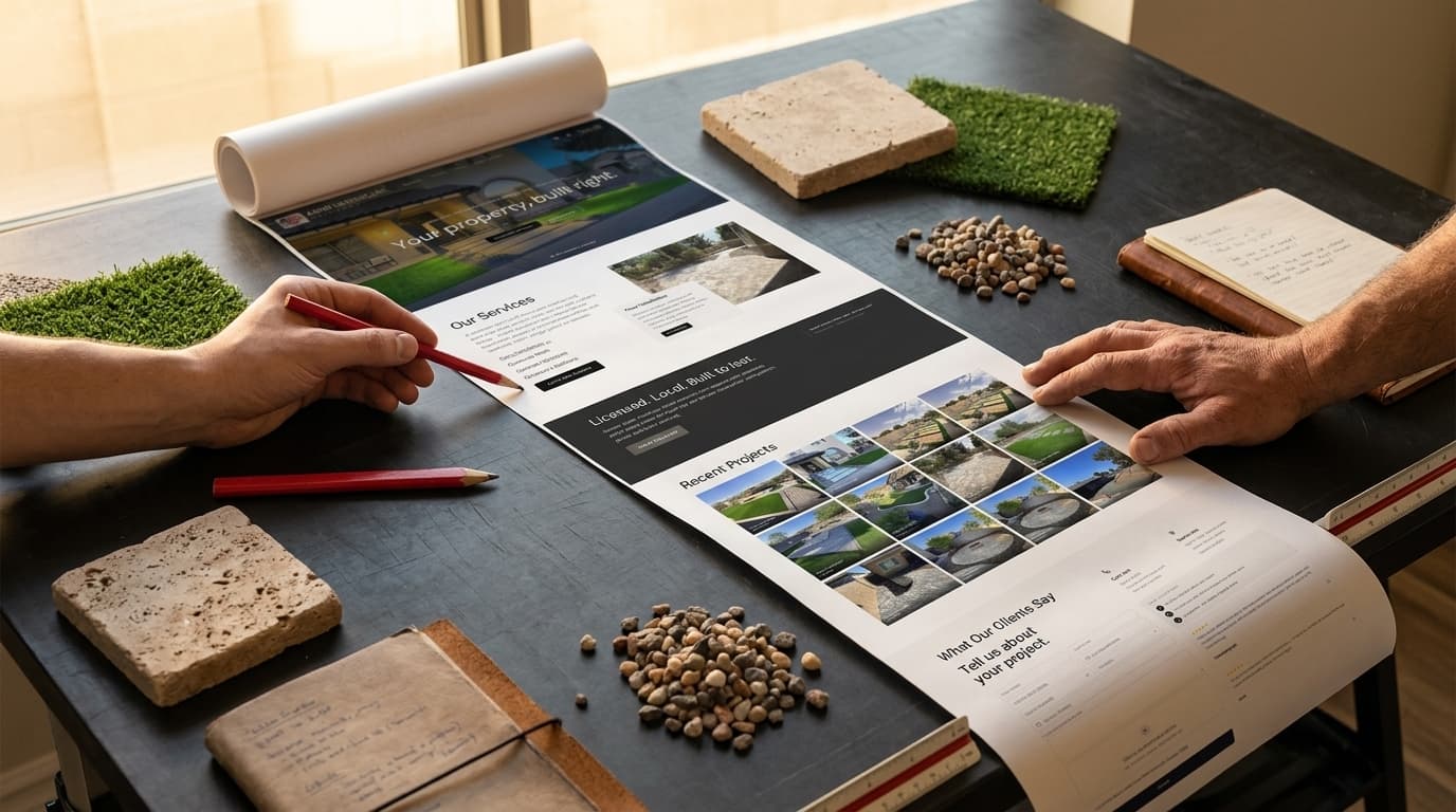
Most local business websites do not need more landing pages. They need a clearer path from "I might need this company" to "I am ready to talk."
That was the plan behind the AMW Hardscape Solutions website. You can also view the live site. It has service pages, an about page, a gallery, and a blog. Those pages help people find the company and research specific work.
The homepage is designed to do the main conversion work: a visitor can understand what AMW builds, where it works, why it is credible, what completed projects look like, and how to request an estimate without leaving the homepage. The top hero section and the service section below it work the hardest.
Supporting pages help people find and research the business. The homepage is built to guide that attention toward a conversation.
One Outcome, Two Ways to Act
AMW's homepage emphasizes two actions:
- Call the company.
- Request a free estimate.
Both lead to the same place: a project conversation.
The phone number serves someone who wants to ask a question now. The form serves someone browsing after hours, comparing options, or wanting to describe the project before speaking with anyone.
The live chat can catch a quick question, but it stays in a supporting role. The homepage still presents the phone and estimate form as the two main ways to start a project in nearly every section.
The page does not give the same visual weight to a newsletter, download, social profile, consultation, financing form, and several differently worded buttons. Those actions may have a place elsewhere. They should not make a new visitor guess what matters most.
The button labels remain consistent throughout the page. "Call" means call. "Free Estimate" leads to the estimate form. Clear labels require less interpretation than "Start Your Journey" or "Let's Connect."
The First Screen Makes the Next Step Obvious
People scroll, but the top of the page still receives the most attention.
Nielsen Norman Group analyzed more than 130,000 eye fixations and found that people spent about 57% of their page-viewing time above the fold and 74% within the first two screenfuls. The useful lesson: reserve that space for the visitor's main questions and actions. Read the scrolling and attention research.
AMW's opening screen answers four questions quickly:
- What does the company build?
- Does it serve my area?
- Is it licensed and insured?
- How do I contact it?
A ready visitor can call or click Free Estimate immediately. The estimate button scrolls to the form on the same page instead of opening another page. One visitor jumps directly to the form. Another keeps scrolling because they need more proof first.
Putting the conversion near the top does not require putting a large form in the hero. It means the next step is visible without searching.
In my heatmaps, I usually see traffic near 100% above the fold, roughly half that in the second section, and a sharp drop-off after that. That lines up with broader research: Contentsquare's 2026 Digital Experience Benchmark, based on 99 billion sessions across 6,500 sites, found scroll rates of 50.5% on desktop and 45.2% on mobile, meaning roughly half of all visitors never scroll past the fold. See the benchmark.
To help visitors move down naturally, I added secondary service jumplinks that push attention to the service section below.
AMW also uses a fixed hero, so the service promise and two main actions do not rotate away. I explain that choice in Drop the Homepage Slider.
The Page Order Removes Objections
A hardscape project is a considered purchase. Homeowners want evidence before inviting a contractor to their property.
The AMW homepage follows the questions they are likely to ask:
- Services: Can this company handle my type of project?
- Licensing and local experience: Is it qualified to do the work here?
- Company information: Who will I be dealing with?
- Project gallery: Does the finished work match what I want?
- Customer reviews: Have other people had a good experience?
- Process: What happens after I request an estimate?
Each section has one job. Together they move the visitor from relevance to trust to action.
This is why a long homepage can convert efficiently: it answers the important questions in a useful order.
Service Modals Keep High-Intent Visitors on the Homepage
The services section gives each service a short explanation and project image. Clicking "Learn More" opens a modal rather than sending the visitor to a separate page.
Each modal adds:
- A larger project image
- A fuller service explanation
- Key installation details
- Controls for browsing all six services
- Free Estimate and Call Now actions
This does more than save a page load. The visitor stays in the homepage flow, gets the detail they asked for, and sees the two conversion choices again while interest in that service is high.
They're additional calls to action, and they still lead to the estimate form or a phone conversation.
The pattern is called progressive disclosure: show the essential information first, then reveal deeper information when someone requests it. Nielsen Norman Group explains the approach.
The service summary still has to make sense before the click. A modal should add depth. It shouldn't be the only place the service actually gets explained.
Separate service pages remain valuable for detailed research and focused search traffic. They just don't have to sit between the homepage and the estimate form.
The Form Is at the Bottom on Purpose
The estimate form appears after the services, credentials, company information, projects, reviews, and process. A full-width Get a Free Estimate section repeats the offer immediately before the form. By the time a cautious visitor reaches it, the page has answered many of the questions that could prevent an inquiry.
The form is not hidden. Every Free Estimate button above it is a scrollto jumplink.
That lets the same page work for someone ready in ten seconds and someone who needs several minutes. The ready visitor jumps. The cautious visitor reads. Both reach the same form.
Repeated buttons appear after useful sections so a person does not have to reverse-scroll once a project photo, credential, or review settles the decision. Repetition makes the same action convenient. It should not introduce a new destination each time.
A Landing Page Does Not Create Its Own Traffic
Publishing a dedicated landing page does not create an audience. Traffic still has to come from advertising, email, social media, a search result, or a direct link.
Many local-business visitors already reach the homepage through branded searches, referrals, direct visits, and Google Business Profile links. Improving that page can help traffic the business already has without requiring another campaign to feed it.
Measure this rather than assuming it.
In Google Analytics, a landing page is simply the first page viewed in a session. It might be the homepage, a service page, or a blog article. The GA4 Landing Page report shows which pages receive entry traffic and what those visitors do next. Google explains the report here.
Invest first in the page where incoming visitors become good leads. For many local businesses, that is the homepage. If a service page brings in serious search traffic, it also needs a direct phone and form path.
Homepage-first should not mean homepage-only.
When a Separate Landing Page Makes Sense
Use a dedicated landing page when the message needs to be more specific than the homepage:
- A paid ad for one service
- An offer limited to one city or customer type
- A seasonal campaign with detailed terms
- A commercial service aimed at a different buyer
- A campaign that needs separate tracking and testing
If an ad promises artificial turf installation in Queen Creek, the page should continue that exact promise. It should not make the visitor search a general homepage for the turf section. Google Ads recommends matching the page to the ad, keywords, offer, and call to action because relevance affects the visitor experience and advertising performance. Review Google's landing-page guidance.
A broad seasonal offer can appear in the homepage hero or directly below it when it applies to most visitors. Run one clear campaign at a time and keep the normal call and estimate actions available.
The Form Is Not the End of the Conversion
The form should collect only what the business needs to begin a useful response. Ask for contact details, service interest, project location, and a short description if those details help the first conversation. Collect the rest later.
Beside the AMW form, the page explains the service area, contact information, business hours, and what happens next. That makes the request feel more predictable.
Once the form is submitted, the lead needs to reach a real follow-up process. A 2011 cross-industry study published by Harvard Business Review found that companies attempting to contact online leads within an hour were nearly seven times more likely to qualify them than companies waiting even one additional hour. The study measured qualified conversations rather than completed sales, but it still shows why response time deserves attention. Read the lead-response study.
For a practical way to review this step, read Respond Before You Discount.
An automated confirmation can acknowledge the request. A person still needs to respond within the promised window.
The full path is simple: a clear page leads to an easy action, the lead gets captured, someone responds fast, and the visitor ends up on the calendar for an estimate.
Audit the Page Before Building Another One
Before paying for another landing page, check the homepage:
- Can a visitor identify the service and area in the first screen?
- Are the main phone and form actions visible near the top?
- Do repeated buttons lead to the same destinations?
- Does each section answer a real buying question?
- Can visitors see credentials, projects, reviews, and the process?
- Is the form short, mobile-friendly, and clear about what happens next?
- Does the page load quickly with the gallery, chat, and tracking scripts active?
- Are calls, form submissions, good-fit leads, and scheduled estimates measured?
If the homepage already produces good leads, improving that path may create more value than adding another page nobody has a plan to visit.
That's the bet behind AMW Hardscape's homepage: get more out of the traffic already showing up before spending to find new places to send it.